
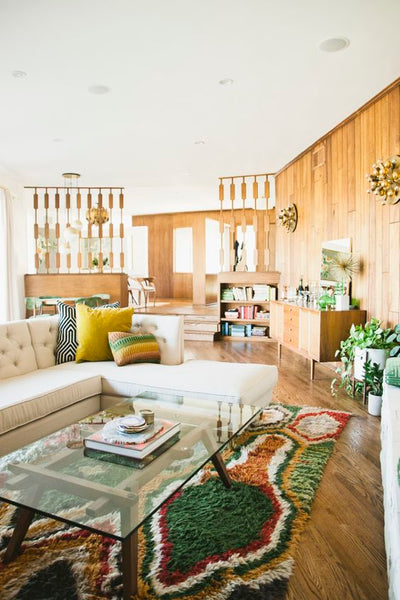
The 1970s are making a comeback in home decor, and it's not just the shag carpets and macrame. The warm, earthy tones and bold, vibrant colors of the 1970s color palette are finding their way back into our homes.
In this blog post, we'll explore the resurgence of the 1970s color palette and how you can incorporate it into your own home. So, get ready to take a trip back in time and discover the beauty of the 1970s color palette.
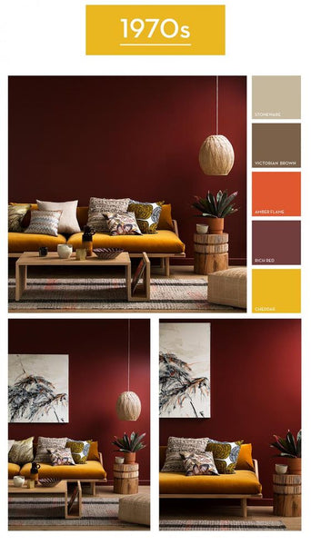
The Color Trends of the 1970s
The 1970s was a decade filled with bold and vibrant color trends. The color palette of this era was heavily influenced by hippie culture, disco, and pop art. One of the most iconic color trends of the 70s was the use of earthy colors, such as mustard yellow, avocado green, and burnt orange. These colors were often combined with deep browns and rustic reds to create a warm and cozy atmosphere.
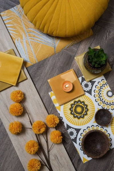
70's Revival with mustard yellow. Source: Pinterest
In addition to earthy tones, the 70s also saw the rise of bold and bright colors like electric blue, hot pink, and bright orange. These colors were often used in combination with geometric patterns and abstract designs, which were popular in the disco era. The use of metallic colors like gold and silver was also common, especially in home decor and fashion.
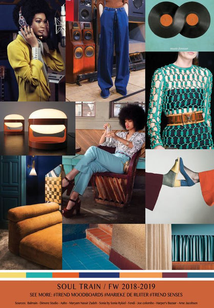
70's Revival with bold and bright colors. Source: Pinterest
Another popular color trend of the 70s was the use of pastels. Soft pinks, baby blues, and light greens were often used in combination with white to create a fresh and airy look. This color palette was commonly used in home decor, particularly in bedrooms and bathrooms.
70's Revival with pastels. Source: Pinterest
Overall, the 1970s color palette was a diverse mix of bold and vibrant colors, earthy tones, pastels, and metallics. It was a time of experimentation and self-expression, and the colors used in home decor and fashion reflected that.
Today, the vintage 1970s color palette is making a comeback, with designers and homeowners embracing the retro 70s color palette to create a unique and eclectic look in their homes.
Popular 1970s Color Palette Combinations
The 1970s was an era of experimentation and self-expression, and the same was true for color palettes. The decade saw a wide range of color combinations that are still popular today. Here are some of the most popular 1970s color palette combinations:
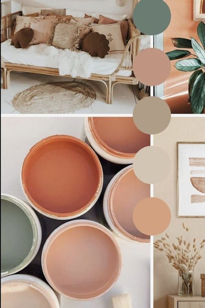
1. Earth Tones and Neutrals
The use of earth tones and neutrals was a defining feature of 1970s color palettes. These colors were often paired with each other, creating a warm and cozy vibe. Popular earth tones of the era included mustard yellow, olive green, burnt orange, and rust. Neutrals like beige, brown, and tan were also used to ground the palette.
Earth Tones and Neutrals - 1970s Color Palette Combinations. Source: Pinterest
2. Bright and Bold
While earth tones and neutrals were popular, the 1970s also saw a rise in bright and bold colors. Think psychedelic colors like hot pink, bright purple, and electric blue. These colors were often paired with each other or with black to create a dramatic effect. This color palette was a nod to the era's counterculture and rebellion against traditional values.
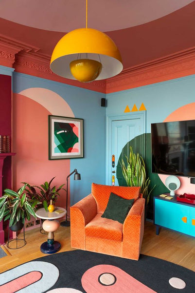
Bright and Bold - 1970s Color Palette Combinations. Source: Design Milk
3. Muted and Moody
On the other end of the spectrum, the 1970s also saw a rise in moody and muted color palettes. These palettes were often inspired by nature and included colors like deep green, navy blue, and maroon. These colors were paired with other muted tones like brown and gray to create a calm and serene atmosphere.
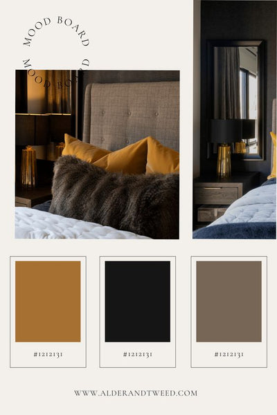
Muted and Moody - 1970s Color Palette Combinations. Source: Alder & Tweed Design Co.
4. Tropical and Vibrant
The 1970s also saw a rise in tropical and vibrant color palettes. These palettes were inspired by exotic locations and included colors like turquoise, coral, and lime green. These colors were often paired with each other or with white to create a breezy, beachy vibe.
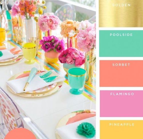
Tropical and Vibrant - 1970s Color Palette Combinations. Source: Pinterest
Retro 70s color palettes are making a comeback in home decor, with many designers drawing inspiration from this era. Whether you prefer earth tones, bold and bright colors, muted tones, or tropical hues, the 1970s have a color palette that can work for any home.
Read more:
- 5 Minimalist Color Palettes for Your Home Interior
- Unwind in Style: Using Light Summer Color Palette to Create a Serene Home
1970s Color Palettes in Different Rooms
If you're a fan of retro style, incorporating the 1970s color palette into your home decor can be a great way to add a nostalgic touch to your space. The bold and vibrant colors of the era are making a comeback and are perfect for creating a fun and playful atmosphere. Here are some ideas for using the 1970s color palette in different rooms of your home:
Incorporating the 1970s color palette into your home decor can add a unique and retro touch to your space. Don't be afraid to experiment with different color combinations and have fun with them!
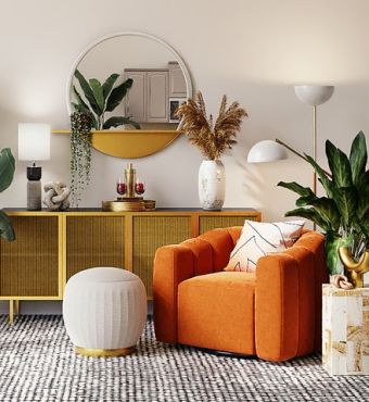
1. Living Room
The living room is the perfect place to experiment with the retro 70s color palette. You can create a cozy and inviting space by using warm earthy tones such as rust, mustard, olive green, and chocolate brown. You can also add pops of bright colors like orange, pink, and turquoise to add some excitement to the room. Use the 70s color palette hex codes to find the exact shades you want.
1970s Color Palettes in Living Room. Source: Pinterest
2. Kitchen
In the kitchen, you can use the 1970s color palette to create a fun and funky vibe. Consider using bright and bold shades like avocado green, harvest gold, and burnt orange for your cabinets, countertops, and backsplash. You can also add some retro accessories like a colorful vintage fridge or a funky patterned rug to complete the look.
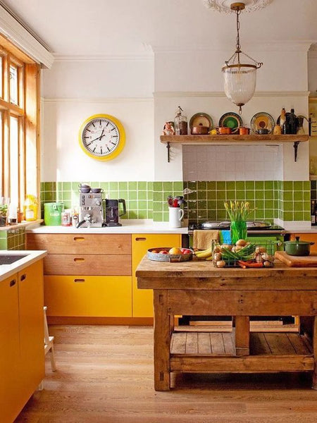
1970s Color Palettes in Kitchen. Source: Pinterest
3. Bedroom
For the bedroom, you can use the muted and moody shades of the 1970s color palette to create a calming and relaxing space. Consider using shades like olive green, deep red, and burnt sienna for your bedding and curtains. You can also add some hippie 70s color palette-inspired decor like macrame wall hangings or a shag rug to give the room a bohemian vibe.
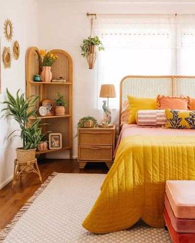
1970s Color Palettes in Bedroom. Source: Pinterest
4. Bathroom
In the bathroom, you can use the tropical and vibrant shades of the 1970s color palette to create a fun and playful space. Consider using shades like coral, turquoise, and lime green for your tiles and shower curtain. You can also add some retro accessories like a vintage mirror or a colorful bath mat to complete the look.
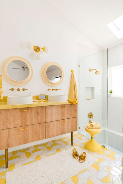
1970s Color Palettes in Bathroom. Source: Fireclay Tile
Incorporating the 1970s color palette into your home decor can add a unique and retro touch to your space. Don't be afraid to experiment with different color combinations and have fun with them!
The 1970s Color Palette in Modern Design
The 1970s color palette has made a comeback in modern home decor. This retro 70s color palette is now being used to create a funky, bold, and playful ambiance in homes. Whether it's the 70s disco color palette, the 70s-inspired color palette, or the earth tone 70s color palette, it's clear that these vintage hues have become popular again.
1. Current trends incorporating 1970s colors
The 70s color palette is popping up in modern home decor in various ways. One popular trend is the use of earthy tones such as mustard yellow, olive green, and burnt orange in furniture and accent pieces. The warm and inviting nature of these colors gives off a cozy and comforting vibe that can elevate any room.
Additionally, bold patterns and textures in fabrics and wallpapers that were popular in the 70s are also making a comeback. These retro-inspired patterns are a great way to add a fun and playful touch to your decor.
Current trends incorporating 1970s colors. Source: DecorMatters
2. The future of the 1970s color palette in home decor
As the popularity of the 70s color palette continues to rise, it's clear that these earth-tone and disco-inspired colors will remain a staple in modern design. The key to incorporating them into your decor is to balance them with neutral hues or use them sparingly as accents.
Additionally, modern technology has made it possible to create updated versions of the classic 70s colors that are more suitable for contemporary design. With the 70s inspired color palette and our Seasonal Decor, the possibilities are endless.
70s-inspired home decor. Source: Pinterest
Conclusion
In conclusion, the 1970s color palette has made a comeback in modern design, with its retro charm and earthy tones bringing warmth and nostalgia to any space. From bold and bright to muted and moody, these colors can be used to create a range of looks in different rooms.
And with current trends incorporating the 70s disco and 70s-inspired color palettes, it's clear that this style is here to stay. Whether you opt for a full-on retro vibe or just a subtle nod to the past, the 1970s color palette is a versatile choice that adds depth and character to any home.
So why not try incorporating these earth tone 70s color palettes into your next design project and see how they can transform your space into a light summer color palette that exudes cool and casual vibes?